Introduction
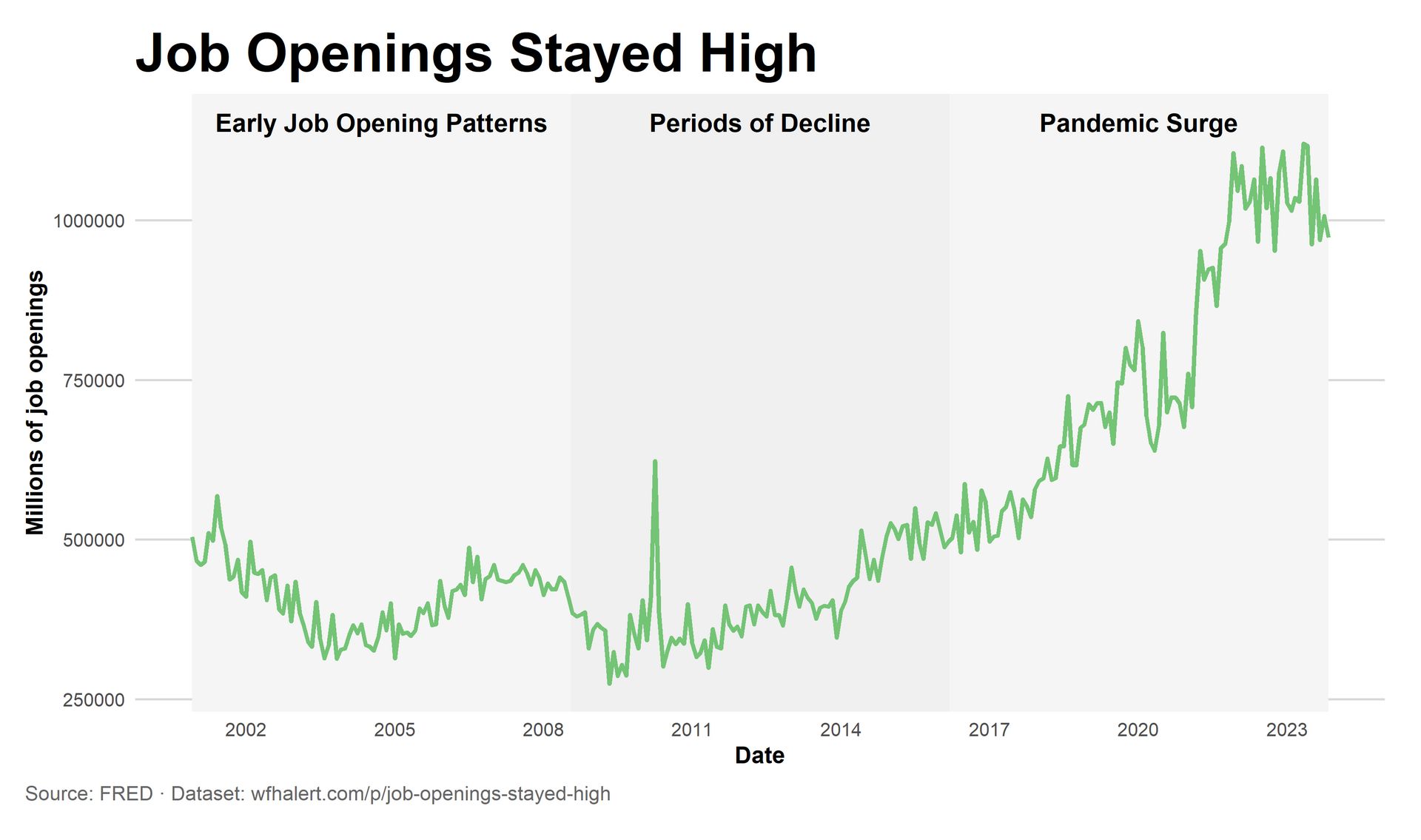
The chart shows job openings in the United States. The data comes from the Job Openings and Labor Turnover Survey (JOLTS). The numbers are shown over time. The line goes up and down. This shows how job openings change as the economy changes.
Early Job Opening Patterns
For many years, job openings stayed within a small range. The changes were slow and steady. This is normal. Open jobs increase when business is strong. They decrease when growth slows. During this time, the job market looks stable.
Periods of Decline
The chart also shows times when job openings fall. These drops happen during economic downturns. When businesses earn less, they post fewer jobs. Even during these periods, job openings later return to earlier levels. The drops do not last forever.
Pandemic Surge
After 2020, the pattern changes. Job openings rise very fast. They reach levels never seen before. This rise is much larger than in the past. What is different is that job openings do not fall back to normal levels. They stay high for years.
Long-Term Shift
When looking at the full chart, a new pattern appears. Job openings move to a higher level after the pandemic. High openings become common. This suggests a lasting change in the job market.
Remote Work
High job openings help explain remote work. When businesses cannot fill jobs, they look for workers in more places. Remote jobs allow hiring from anywhere. This helps businesses fill roles and helps workers find jobs.
Why This Matters
People often debate the strength of the job market. This chart helps explain why. Job openings are high and remain high. The data shows this change is real. It is not a short-term spike.
Dataset
Data Sources
Federal Reserve Economic Data (FRED)
https://fred.stlouisfed.org/series/LMJVPBUVUSM175S
Notes and Methodology
The chart uses U.S. job opening data from JOLTS. The data shows how many jobs are open over time. No seasonal changes were made. The full timeline shows stable periods, declines, and the post-2020 shift.
